Spring colors for interior walls are trending for a reason—and when you’re thinking about interior house painting in Mission Viejo, CA, spring gives you the perfect excuse to finally get it done. The days are brighter, the air feels lighter, and your walls might be begging for a fresh coat of color. Whether you’re leaning warm or cool, this is the season for trying something new.
As a local interior house painter serving Orange County, I can tell you: there’s something about spring light in Mission Viejo that makes color come alive. The shift from gray winter tones to something softer and cleaner is refreshing. If you’ve been asking yourself what colors look best on spring walls, the list below might give you just the inspiration you need.
Key Takeaways

|
Spring painting projects benefit from longer daylight and lower humidity levels. |
|
|
Warm yellows, soft whites, and dusty blues match California’s relaxed, sunny vibe. |
|
|
Greens and creams help anchor open-concept layouts without making them feel heavy. |
|
|
Always sample colors on different walls before committing. |
|
|
Hiring a local pro helps you avoid rookie mistakes and get it done faster. |
Why Spring Makes Interior Painting So Much Easier in SoCal
Compared to the rest of the country, Southern California has painting weather nearly year-round. But spring still stands out. It’s that sweet spot where humidity is low, the temperature is stable, and the natural light is just right.
One of my longtime clients swears by spring house painting. Every other March, she refreshes one room in her home, and she says the color always looks better in spring than any other season. There’s something about the way sunlight hits the walls—it just feels more alive.
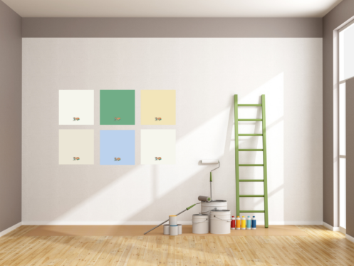
5 Best Spring Colors for Interior House Painting
1. Windmill Wings 2067-60 – Soft Blue with a Splash of PersonalityWindmill Wings is one of those shades you don’t expect to love until you see it on the wall. It’s a delicate periwinkle with a cool undertone that feels modern but not trendy. We used it in a nursery near Lake Mission Viejo, and the way the light danced off the walls was gorgeous. Pair it with soft whites, pale wood tones, or warm grays for a space that feels playful and relaxed. It’s a great pick for bedrooms, bathrooms, or reading nooks. Windmill Wings adds energy and calm at the same time—a solid win for spring house painting. |

|
2. Weston Flax HC-5 – Gentle Yellow That Feels Naturally SunnyIf you’re craving warmth without going full-on gold, Weston Flax is your color. This buttery yellow works well in rooms where you want the sun to stick around, even when it’s cloudy. We used Weston Flax in a Mission Viejo kitchen with white cabinetry and sage green tile. The result was cheerful but classy. The room felt pulled together, not loud. Use this color in kitchens, entryways, or even laundry rooms—anywhere you want a soft glow all day long. |

|
3. Simply White OC-117 – Clean, Versatile, and Always in StyleSimply White is the go-to color for anyone who wants their home to feel bigger, cleaner, and lighter. This isn’t a cold white—it has just enough warmth to feel welcoming. In a Casta del Sol home, we used Simply White on walls, ceiling, and trim with varying finishes. It created a soft, seamless look that still had dimension. The best part? It worked with the client’s existing furniture and décor without needing any updates. This color is ideal if you want one shade throughout your home that still looks elevated. |

|
4. White Down OC-131 – Creamy Neutral That Plays Well with EverythingWhite Down is a soft, creamy off-white that works as a base or main wall color. It’s got more personality than a plain white but still feels neutral. We used this shade in a split-level off Olympiad Road, tying together the living and dining areas with ease. It worked well with natural wood, dark hardware, and even a teal accent wall. White Down is the kind of color that helps everything else shine—it’s subtle but strong. |

|
5. Stokes Forest Green 2035-40 – Rich Green That Grounds a SpaceIf you’re looking for a deeper tone to anchor a room, Stokes Forest Green is a solid option. This earthy green works great in home offices, dens, or feature walls. We used it in a home near the Sierra Rec Center for built-in shelves. The bold color gave the space sophistication without making it feel formal. The client even added vintage brass light fixtures to complete the look. Pair this color with light neutrals, soft leather, or wood accents for a stylish, balanced feel. |

|
How to Pick the Right Paint Color for Spring
Choosing spring colors for interior spaces means thinking about light, contrast, and how a room functions. Natural light in Mission Viejo varies by time of day and window direction, which means your color might look totally different in the morning than it does in the evening.
I always tell clients: paint a big sample and leave it up for three days. Test it under overhead lights and with your blinds open. The color will show its true personality that way.
Also, consider finishes. A satin or eggshell sheen works great in living rooms and hallways, while flat might be better for ceilings. Little choices like these really affect how a spring house painting project turns out.
Why Hiring a Local Interior House Painter Makes a Difference
Local house painters understand how your home’s light, layout, and materials impact the final color. That matters more than people think. If you’re taking on interior house painting, you want someone who’s worked in Mission Viejo homes before.
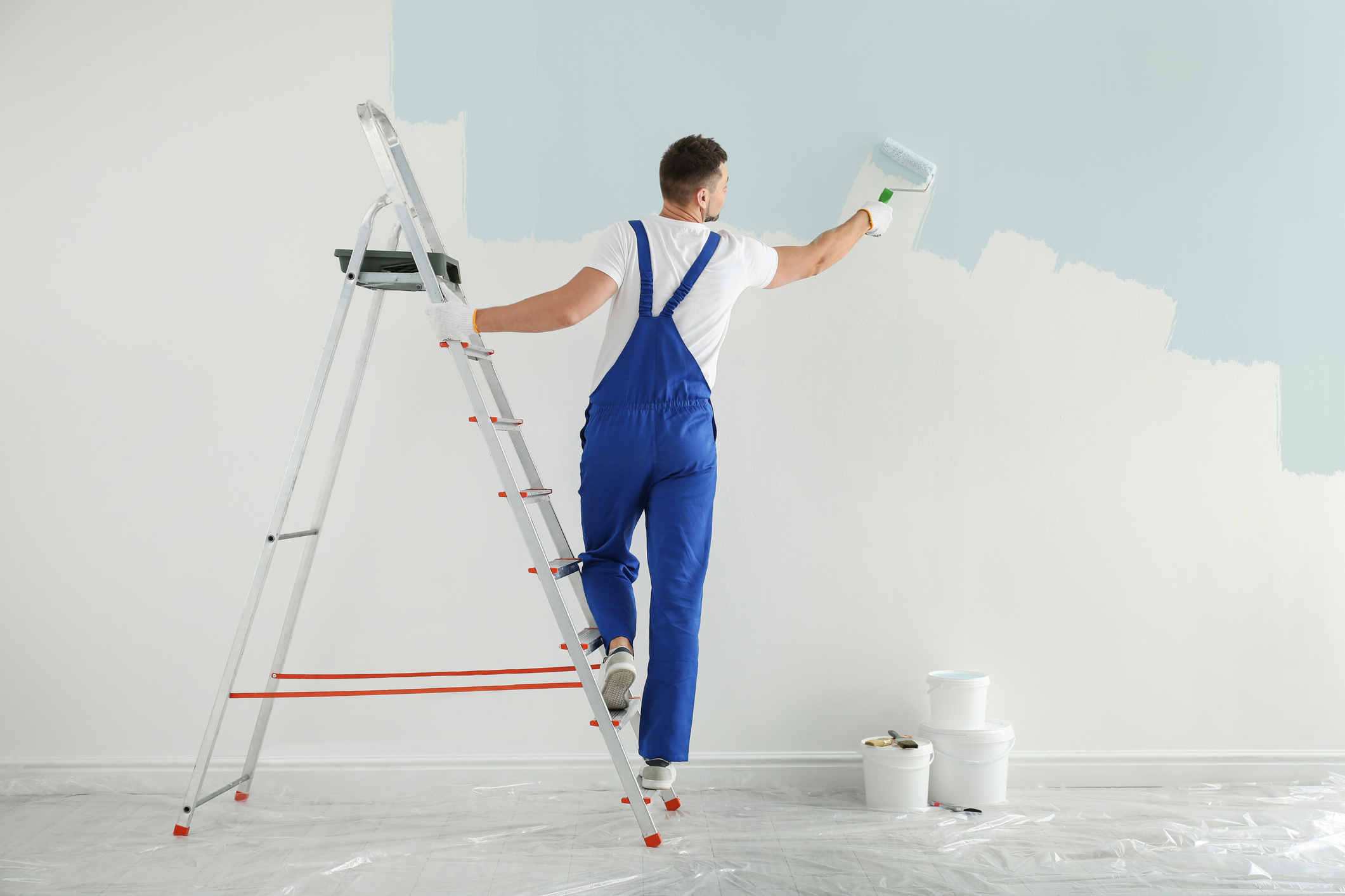
At Rock & Rollers Painting, we help you find colors that work, not just on the swatch, but in your home. From Orange County to Los Angeles County, we’ve helped homeowners make smart color choices and enjoy smooth, stress-free paint jobs.
We treat your home like our own—no missed spots, no mess, and no guessing games.
Rock & Rollers Painting: Your Go-To Painter for Spring Interior Painting
There’s no better time than spring to freshen up your home with new colors. The spring colors for interior projects we’ve covered are proven winners that suit the Mission Viejo lifestyle and light.
If you’re in Newport Beach, Huntington Beach, or Costa Mesa, CA, give Rock & Rollers Painting a call at 949-806-3205 to book your FREE estimate today.
Bright walls. Smooth finishes. Color that makes your space feel brand new. Let’s make it happen.